I was FaceBooking and saw an interesting simple graphic this morning:
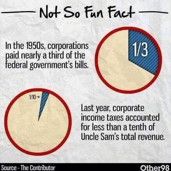
I posted to my friend:
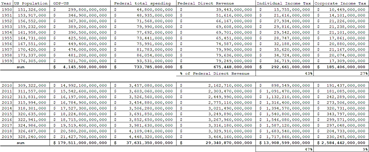
I am such a data nerd. I wanted to see what the numbers were behind these percentages. And I do NOT want to clean the bathroom or the other chores I have waiting for me today. Plus a snoozing Cardigan is curled up beside me. In full confession of my procrastination of what I -should- be doing I went Googling to see if I could find out what the US gross domestic product, federal income tax for business and individual, federal spending, etc, were for each year 1950-1959 and each year 2010-2019.As I look at the numbers, I am not convinced the problem is the percentage that anyone is paying. How much we are federally spending is WAY out of whack for how our population has grown and how our GDP has grown.It sure looks like we are in deep trouble financially. As I compare the numbers, I can see that if for the last 10 odd years businesses had paid closer to 30% instead of 10% it does appear that our spending and revenue would be much closer to equal for the last 10 years.I cannot escape the thought, however, that the problem is NOT who is contributing what, but rather, that we are spending more per capita than is sustainable.My two cents. Probably not worth much.Here is my data chart, and here is the website I used to form my chart. Probably has lots of flaws.Probably only useful in that I snuggled my sweet Cardigan Kate, and put off chores for half an hour <grin>https://www.usgovernmentspending.com/fed_spending_1950USmn